Friday, August 8, 2014

Photostory

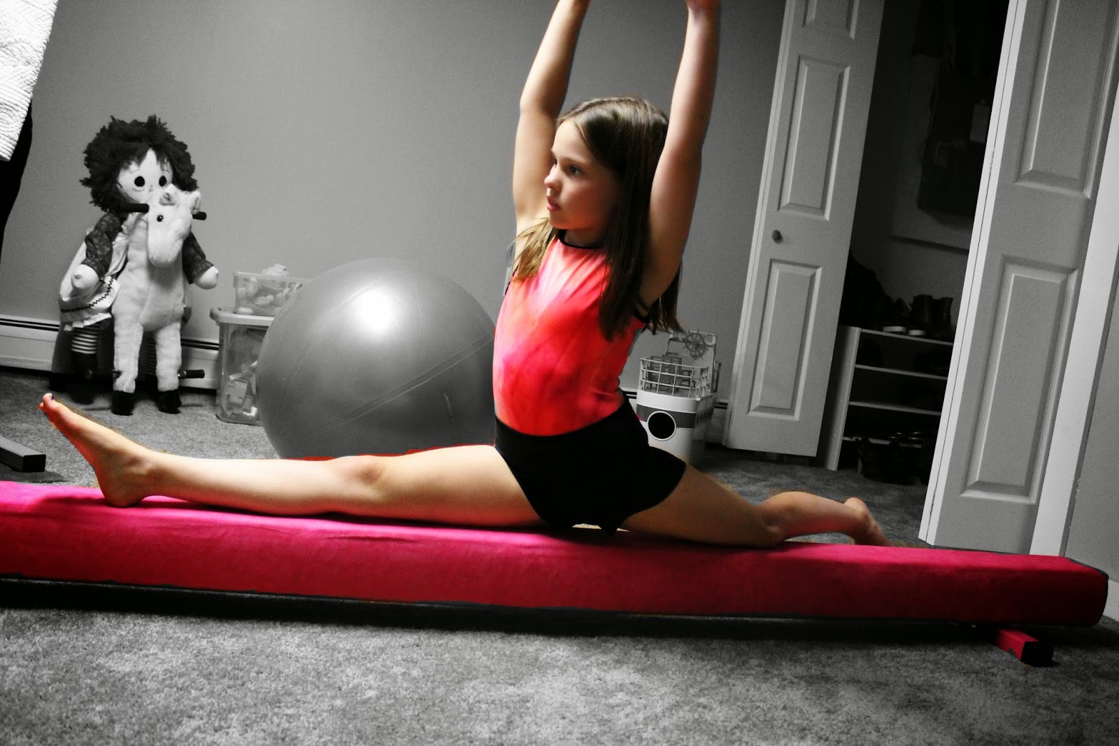
My photo story was theme based. I took photos of different people with something that is very important to them. For editing, I decided to keep the person and object in color and put the background in black and white.

Here is the link to my slideshow: http://slideroll.com/?s=6tescyac

In the caption of each photo I am putting what editing tools I used.

Curves, freestyle selection, desaturate, clone, text

Freestyle select, desaturate, brightness and contrast, filter-drop shadow, gausien blur

Curves, freestyle select, desaturate

Levels, freestyle select, desaturate, clone, move

Freestyle select, desaturate, clone, levels

Freestyle select, desaturate, clone

Freestyle select, filter- unsharp mask, curves, desaturate, clone, text

Curves, freestyle select, desaturate

Curves, freestyle select, desaturate, clone

Levels, freestyle select, desaturate, brightness and contrast, fuzzy boarder filter

Levels, freestyle select, desaturate, clone


Friday, August 1, 2014

Portraits

For my work with portraits I decided to venture out into the woods with one of my friends. I noticed I got the best shots when I distracted her and did not have her look directly at the camera. When she did she would stiffen up. These are my four favorites.


Saturday, July 26, 2014

Photostory Preview

These are some photos I have taken to start working on my photo story. I have decided to go with a theme rather then a sequence of events. I am asking people to take a picture with something that is very important to them. I had taped my dad's injury and he said me, and that I'm going to school for physical therapy and helping him. My mom said our dog, who is like another child to her. I took a picture of my dog with his play skunk that he is obsessed with. The last couple photos are me. One of the most important things to me, beside family, is the ability to run, hike and adventure outside and I wanted to show that. 


Wednesday, July 23, 2014

Clone, text and paint tools

I used the clone tool to edit the wire out of the picture. I had to go over it several times since it was so dark to get it to completely go away. I also had to make sure the sky blended well together.

Before
After

In this photo I first adjusted the levels and the brightness and contrast because the picture was dark and the sky was very gray. I then added the text. I typed it in a another program and then copied and pasted it in. I realized I was not seeing any text I was typing because even though the font was 18, it was set as 18 pixels, so I increased the size to 360. I was imagining this sort of image as being an ad in some kind of outdoor magazine or and brochure for a campground or state park. 


In this next picture I used the airbrush tool under paint tools to add what looks like spray paint on the sign. I played around with the size until I found something that looked realistic. 


Monday, July 21, 2014

Dodge/Burn and Filters

In the first photo I used dodge and burn. I lightened up the gravestone and darkened the grass around it. I also lightened a few leaves because that portion of the image was very dark.


Edited
Original


I used the neon edges filter to give the gravestones a nighttime glow. I also used the fog filter to add the blue/green fog.


Edited
Original

In this image I used the filter cubism to make it look like the image was made out of squares of paper. I really like this filter and want to experiment more with it. Here is the before and after of the picture. 

Original
Edited

Sunday, July 13, 2014

Color Editing

I didn't have any plans for what I wanted to do with the first photo but I knew I wanted to work with this photograph. I started by selecting the cow and using levels to adjust the colors. Then I inverted my selection and put the yellow background in, I believe using the colorize function. I had a lot of fun editing this photo.


The next one I edited a photo I've been wanting to work with. The original was much darker, like everything was coated in a layer of greenness. I researched how to use the curves function and did a simple s curve with this, which I learned increases both contrast and saturation.


I also edited a very old photo of my dad and grandfather fishing when my dad was a kid. However, I cannot get it to export to a file that is able to be uploaded. A gimp error message comes up. Does anybody know how to fix this? I would love to share the before and after shot as it helped a lot.

Saturday, July 5, 2014

Gimp

This week we have been learning the basics in using Gimp. In these photos I practiced using the crop, move and selection tools as well as playing around with using different layers.

In the first photo I combined two pictures, one of the dock and one of the sunset. I cropped the picture of the sunset and selected the portion I wanted in the final picture and deleted everything else. Then, I moved the sunset layer until it was showing above the dock. Lastly, I adjusted the color balance in both layers to help them blend more.


I decided to create this photo based on the funny personalities in my family. The original photo is of the person on the right. I then selected the other two people out of other photos and deleted the area around them. I put them on top of the main layer and set there to be an alpha channel so the background I deleted was transparent. Then I rotated them so they are all facing the same way and moved them. I also changed the layer size of the person on the left since it was much to large. 


The last picture is my favorite. It is one photograph that I created a duplicate layer, selected my grandpa and inverted the selection to delete the background. In the second layer I used desaturate to make it black and white. What is left is my in color grandpa layer on top of the black and white layer of the kids running. 


I have had a lot of fun with this and will continue to practice and maybe update this post as the week finishes out. 

Saturday, June 28, 2014

Landscape

In this project I tried to focus on picture that are landscape, but may not be typical. This first photo I really enjoyed the changes in elevation, as well as the fence as a barrier. 


Of course I did have to do one sunset photo. This was actually taken after the sun set to work on lighting techniques. 

I really like the golden coloring of the hay in this photo. I am upset about the line in the top but I am sure I could try to edit it out once I have more practice. I chose to take this photo because it is an accurate representation of the landscape I have always grown up around. For others, their idea of landscape may be city lights at night. That is what I find cool about landscape, it truly just is the area around you.


This is actually a photo from my house. In general, I would not find it a good photo but working with my idea of what I grew up considering a landscape, this is what I saw everyday when looking out into my yard. I think it represents my family perfectly with the odd array of objects under the patio. 


I thought this photograph would be interesting to put in the project because it is not what most people would think about when considering a landscape. 

This is more of a smaller scale landscape but I thought it was an interesting shot, with the folding chair on a side of the barn. If I knew the farmer I think it would have been cool to also get a shot from the perspective of sitting in the chair and posting them together.


As for getting the perfect photo of a landscape I am not quite there. I am not used to taking photos on a large scale, as I prefer smaller scale photos so I am still experiencing with this. For landscapes though, I think it is about capturing what is real, not just what is pretty.


Sunday, June 22, 2014

Composition Using Lines

This week I researched more about composition, specifically using lines in photography. I decided on this subject because I tend to notice lines in photos and see when they work well but I do not necessarily think about it when composing an image. Through the website photographyicon.com I learned about different kinds of lines.

Vertical lines in an image represent dignity, height and strength.

 Horizontal lines often represent rest, peace and calmness.

Diagonal lines elicit feelings of energy and motion. I have noticed this in pictures because often diagonal lines lead my eye in a direction quickly.

S curves are called the "Line of Beauty" and have meanings of strength as well as beauty. These are common in road and river pictures.

Leading lines in a photograph lead the viewers eye to the subject. For example, these can be fences, railroads and paths. Ideally, leading lines start in the lower left area of a photo, but not right in the corner.

I tried out taking some pictures deliberately choosing lines.

In this photo the horizontal lines of the dock create a peaceful atmosphere.


I thought the curved metal piece and broken wooden pieces created a slight feeling of mayhem intertwined with the familiarity of the white picket fence and farm.


I took this picture before reading more about lines and then notice how the black vertical lines on the sign create a feeling of authority, even though the sign is faded a low speed limit. I think this is a cool contrast.


Framing

As part of learning about composition this week we practiced framing. In this first photo I focused on the well and used the tree as a frame. 


I noticed an old buoy surrounded by wood. I tried to make the wood "frame" blurry, which I think you can see on the vertical piece. 


The next two pictures were inspired by one of the readings, where they used framing in landscape photographs. These were taken on an early morning walk around the lake and up to a farm in Northeast Vermont. I used the trees to frame the lake and the field. 


I think the next picture is interesting because the frame is not completely surrounding the cow's face, but just his nose. For me, this draws my attention to his nose, making it the focus of the image. 


In this photo, I also used trees as the frame. I like how they make an arch over the dirt road as it curves. 


Overall, I enjoyed this project. It pushed me to plan out the pictures I take more and deliberately look for framed images.